Most photographers use RGB when editing images in Photoshop, but have little idea about whats going on in the CMYK world.
In the days of analog, photographers would submit c-prints, negatives or transparencies to their print shops or Art Directors and it was the responsibility of the printer to make the CMYK separations for their presses. However, in the age of digital, it has become increasingly common for photographers to supply CMYK separated images when their clients request them.
CMYK is only slightly more complicated than RGB because CMY is the inverse of RGB. Both color spaces are directly related. If you remember the words "additive color" and "subtractive color" in that art class you took in college then you have a much better memory than I do.
Very quickly, additive and subtractive color goes something like this. If you add Red in RGB color space, you are adding red to the visible spectrum. In CMYK, if you add Cyan, you are subtracting Red from the spectrum. So, CMY is the inverse of RGB. Cyan subtacts Red. Magenta subtracts Green. Yellow subtracts Blue. Additionally, 100% RGB equals white and 100% CMY equals black.
RGB and CMYK are the same, but just turned upside down.
But what about that fourth letter in CMYK? What's that all about? In printing, 'K' or Black is a futz. A hack. A bailing wire and chewing gum solution. We shouldn't need it at all, but we do, and here are the reasons why.
Ink is printed in percentages of halftone dots. If we print 100% of Cyan, it means there are no halftone dots! So, if I print 100% Cyan, 100% Magenta and 100% Yellow that means all the color plates are "wide open" and we are printing at 300% ink density. The more precise term is Total Area Coverage or TAC for short. TAC300 is a quick way to note this down.
I saw you nodding off but stick with me.
So here is our problem. On thin, inexpensive media, such as newsprint running through web presses (very fast, very large, roll fed printing press), TAC300 is far too much ink for that paper to handle.
In the best case scenario, the image will look dark and muddy and will bleed right into the important news article on the other side. The worst case scenario is that the paper will become saturated with ink and disintegrate on press like a cheap paper towel held under a running faucet.
Either way, it's not pretty.
Newsprint works at TAC240, not TAC300, which is fully 60% less than what our three inks can do. So how are we to print dark colors in an image if we have to screen each color plate back to 80%? As strange as it may sound, the answer is to add another ink! One that is completely neutral and which can help us make our colors darker with a lot less ink.
Lets say we are printing red with 100% Magenta and 100% Yellow on newsprint.This red is already at 200% TAC, but we want the color to be much deeper. Without black, we would have a serious problem because Cyan just isn't that dark. We would need a lot more Cyan to equal the same darkening value as only a little bit of black can do and, as we mentioned before, newsprint won't allow us to use more than TAC240. This is the reason we use black ink in addition to CMY.
Black also comes in handy in all sorts of printing environments. While newsprint can only handle TAC240, other types of presses running coated media can handle a lot more ink, sometimes up to TAC360 or more. We use that extra ink load to create darker and richer and colors than CMY alone could accomplish.
We've discussed how RGB and CMYK are similar and why we add Black to account for different Total Area Coverage (TAC) requirements on press and paper. All of the complicated decisions about CMYK are decided for you when you convert from RGB to CMYK in Photoshop. Specifically, all the decision are being made by the CMYK ICC Profile you are converting into.
There are a few more things about CMYK that I will cover in subsequent posts. For now, I wanted to show the similarities of RGB and CMYK and a few differences as well. If you are not 100% comfortable making your own CMYK separations in Photoshop, request help from your printer about which profiles you should use and always demand contract proofs such as a Kodak Approval from your printer.
Until next time.
Friday, November 21, 2008
Wednesday, November 19, 2008
What is neutral?
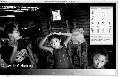
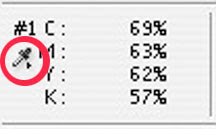
If you are familiar with the eyedropper tool, then you probably see a lot of CMYK numbers like these shown in the info pallet. To tell the truth, I haven't made color decisions in CMYK for a long time. For most critical decisions, there are simply much better color spaces to choose from. Lets take neutrals for example.
The CMYK values 69,63,62,57 doesn't really tell me if it's neutral. Not very clearly anyway. In fact, if I thought about it, I'd probably wonder why Cyan is so much higher than the Magenta and Yellow but we'll save that discussion for another post. For now, let us use a color space that actually tells us what we want to know about neutrality.
Examining the info pallet, notice the icon to the left of the color numbers. It's actually a pull down menu. Click on it and select Lab.
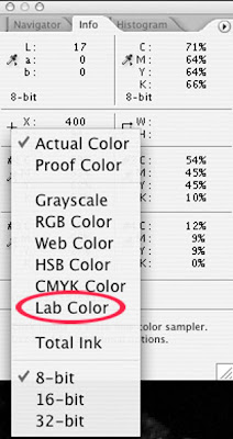
Now, you'll see that the CMYK values are displayed in Lab. The great thing about Lab is that the L channel carries all the light and dark information where the a and b channel contains the color. If BOTH a channel and b channel equal 0, then it is neutral. Guaranteed. If your monitor, proofer, press or whatever shows it is NOT neutral, then there is something wrong with the monitor, proofer or press. Period. It's nice to have that level of confidence especially when color can be so subjective.
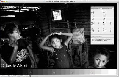
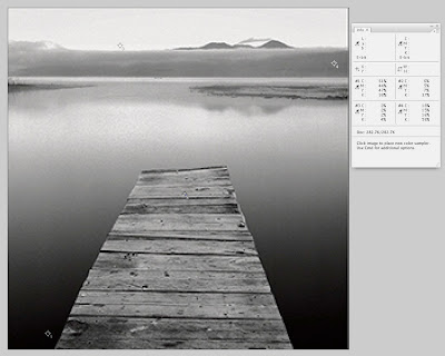
Though we like to have a 0/0 in the L*a*b color channels, being off by one or two points is usually not a deal breaker. It is nearly impossible to maintain that level of precision when using the Richard Free Technique or the Uber-K Separation. If you click on the image above, you'll notice that this image is perfectly neutral within it's current color space. It was transformed into U.S Web Coated (SWOP)v2 using the Muckian Maneuver.
In this post, you've learned how to determine if a value is truly neutral, within it's assigned color space. Good luck and happy printing.
Special thanks goes out to the very talented photographer Leslie Alsheimer who gave us permission to feature one of her images for this article. Visit her site to see more examples of excellent black & white photography. Also visit Santa Fe Digital Darkroom where Leslie contributes her skills to help photographers get the most out of their images.
Monday, November 17, 2008
UberK Separations
Guaranteeing neutrality on press has always been problematic with CMYK separations. If we lived in a perfect world, neutral images would be very simple. I'll go over three techniques for creating neutral images in CMYK. The first technique would be for the 'perfect world' and the remaining two will explain how to help the press maintain neutrals even when the press is not exactly color balanced.
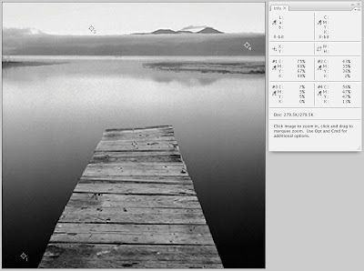 This is a grayscale image from OnSite's color test file. You can download the original target here. We've converted it to U.S. Web Coated (SWOP)v2 CMYK space and have set a few color eyedropper points on the image.
The Muckian Maneuver --
I call this the Muckian Maneuver, named after a retoucher in Dallas, Texas in late 1990's who invented this Photoshop technique. Mr. Muck never shared it with anyone but fortunatly a co-worker named David Wilson "backwards engineered" the method which only goes to prove that once you know something can be done, it simply takes time and effort to discover how its done.
The technique is very simple and effective. Simply open a color image you want to neutralize, convert it to grayscale and then convert it back to CMYK. (Some people copy the color image into a new channel, copy the channel and paste into the color image. Same thing.)
The result is a perfectly neutral image within the color space you pasted into. For instance, if you were using U.S. Web Coated (SWOP) under the CMYK settings in Photoshop, then the image will print neutral provided you were running to an American web press with appropriate #5 groundwood paper, and the press was in good shape. If you were using SNAP 2007, U.S. Sheetfed, then you could expect the same neutral result provided the image was being printed in SNAP or a Sheetfed press respectively. This concept is at the heart of every color managed system ever created.
The Muckian Maneuver is great, and I use it regularly, however, sometimes I want to guarantee that no matter what, the image will not print off-neutral. However, I have to sacrifice the depth of blacks to create this effect. This is often a satisfactory exchange, but you can be the judge of this.
The Richard Free Technique --
Richard Free is a long-time retoucher in Guilford, Connecticut who invented this technique. It's quite brilliant though it requires an understanding of "old school" CMYK separations and balancing the Cyan against the Magenta/Yellow to maintain neutrality. Still, it's nothing you can't perfect without a bit of practice. Lets give it a try.
 This is a grayscale image from OnSite's color test file. You can download the original target here. We've converted it to U.S. Web Coated (SWOP)v2 CMYK space and have set a few color eyedropper points on the image.
 Notice there is a significant amount of color inks (CMY) creating the image. What we want to do is push most of the color inks OUT of the image and place it into the black ink channel. We'll use Channel Mixer to do this.
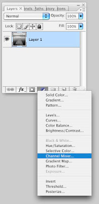
Now, go to the Cyan, Magenta, Yellow channels and reduce their values from 100% to approx 50%. Then, go to the Black channel and reduce the black to about 60% and increase the Cyan, Magenta, Yellow to about 25%. Keep an eye on your info pallet to watch the CMYK levels before/after.
Notice that the image on screen looks nearly identical to the original separation (click the preview check box to see this). Notice that we are re-creating a grayscale image within the black channel and leaving some important color information. Doing this technique will reduce your total ink density quite dramatically, however it's the only way to ensure that color casts on press will be eliminated or drastically reduced.
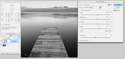
Unfortunately, there is no magic bullet for the Richard Free Technique. Some images will fall into place naturally without shadow detail loss while other images will require a lot of tweaking, masking and other modifications. However, there is one more technique that does make this very simple.
The Uber-K separation --
The first thing we need to do is to download the Uber-K profile and load it into your ColorSync folder so PhotoShop has access to it. Once you load the profile, simply go the Edit menu in PhotoShop and select "Convert To Profile...". Select the Profile named "TAC260_GCR100k100K00genUBER.icc" in the pop-up menu and hit OK.
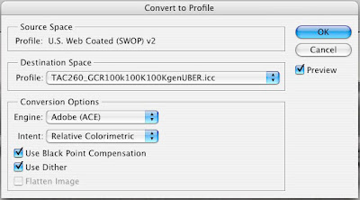
You're done! Examine the info palette and color channels.
The profile you downloaded, "TAC260_GCR100k100K00genUBER.icc", was made in 2006 in an attempt to automate the Richard Free Technique and I think it was pretty successful. Though this is not exactly proper use of an ICC color profile, it is a clever way to bypass neutrality issues on press as well as inkjet printers! The data the profile was generated from was a Kodak Approval XP2 running the D2222 media set.

Now, go to the Cyan, Magenta, Yellow channels and reduce their values from 100% to approx 50%. Then, go to the Black channel and reduce the black to about 60% and increase the Cyan, Magenta, Yellow to about 25%. Keep an eye on your info pallet to watch the CMYK levels before/after.
Notice that the image on screen looks nearly identical to the original separation (click the preview check box to see this). Notice that we are re-creating a grayscale image within the black channel and leaving some important color information. Doing this technique will reduce your total ink density quite dramatically, however it's the only way to ensure that color casts on press will be eliminated or drastically reduced.

Unfortunately, there is no magic bullet for the Richard Free Technique. Some images will fall into place naturally without shadow detail loss while other images will require a lot of tweaking, masking and other modifications. However, there is one more technique that does make this very simple.
The Uber-K separation --
The first thing we need to do is to download the Uber-K profile and load it into your ColorSync folder so PhotoShop has access to it. Once you load the profile, simply go the Edit menu in PhotoShop and select "Convert To Profile...". Select the Profile named "TAC260_GCR100k100K00genUBER.icc" in the pop-up menu and hit OK.

You're done! Examine the info palette and color channels.

The profile you downloaded, "TAC260_GCR100k100K00genUBER.icc", was made in 2006 in an attempt to automate the Richard Free Technique and I think it was pretty successful. Though this is not exactly proper use of an ICC color profile, it is a clever way to bypass neutrality issues on press as well as inkjet printers! The data the profile was generated from was a Kodak Approval XP2 running the D2222 media set.
Summary --
We've shown you three different ways to create perfectly neutral CMYK images. The last two techniques are designed to minimize the effect of color drift on press. Lets show you why you may want to use the Richard Free Technique or the UberK separation for your projects. Like we said before, if the world were perfect, neutral CMYK images would be as easy as coping a grayscale image into the CMYK photoshop document but since color tends to drift on press, the Free & UberK methods are meant to keep some of the richness of 4C neutrals but minimize color casts should they occur.
We've shown you three different ways to create perfectly neutral CMYK images. The last two techniques are designed to minimize the effect of color drift on press. Lets show you why you may want to use the Richard Free Technique or the UberK separation for your projects. Like we said before, if the world were perfect, neutral CMYK images would be as easy as coping a grayscale image into the CMYK photoshop document but since color tends to drift on press, the Free & UberK methods are meant to keep some of the richness of 4C neutrals but minimize color casts should they occur.
Wednesday, November 12, 2008
Color Management
Hello and welcome my blog about color management. I'm Kevin Muldoon and I've spent countless hours discovering color techniques that I would like to share.
Subscribe to:
Comments (Atom)

